A must-do to undo
Offering escape from a city known for its rollicking and relentless escapade, resort hotel Vdara needed to create a co-branded look and collateral package to launch its joint venture with globally-respected natural skincare brand ESPA.
ESPA (the 'E' stands for 'education'), working with 450 spas in more than 50 countries, was an ideal collaborator to level up operations of the 18,000 square feet of European heat experiences and multifunctional treatment rooms that stretched over two floors of the boutique property.
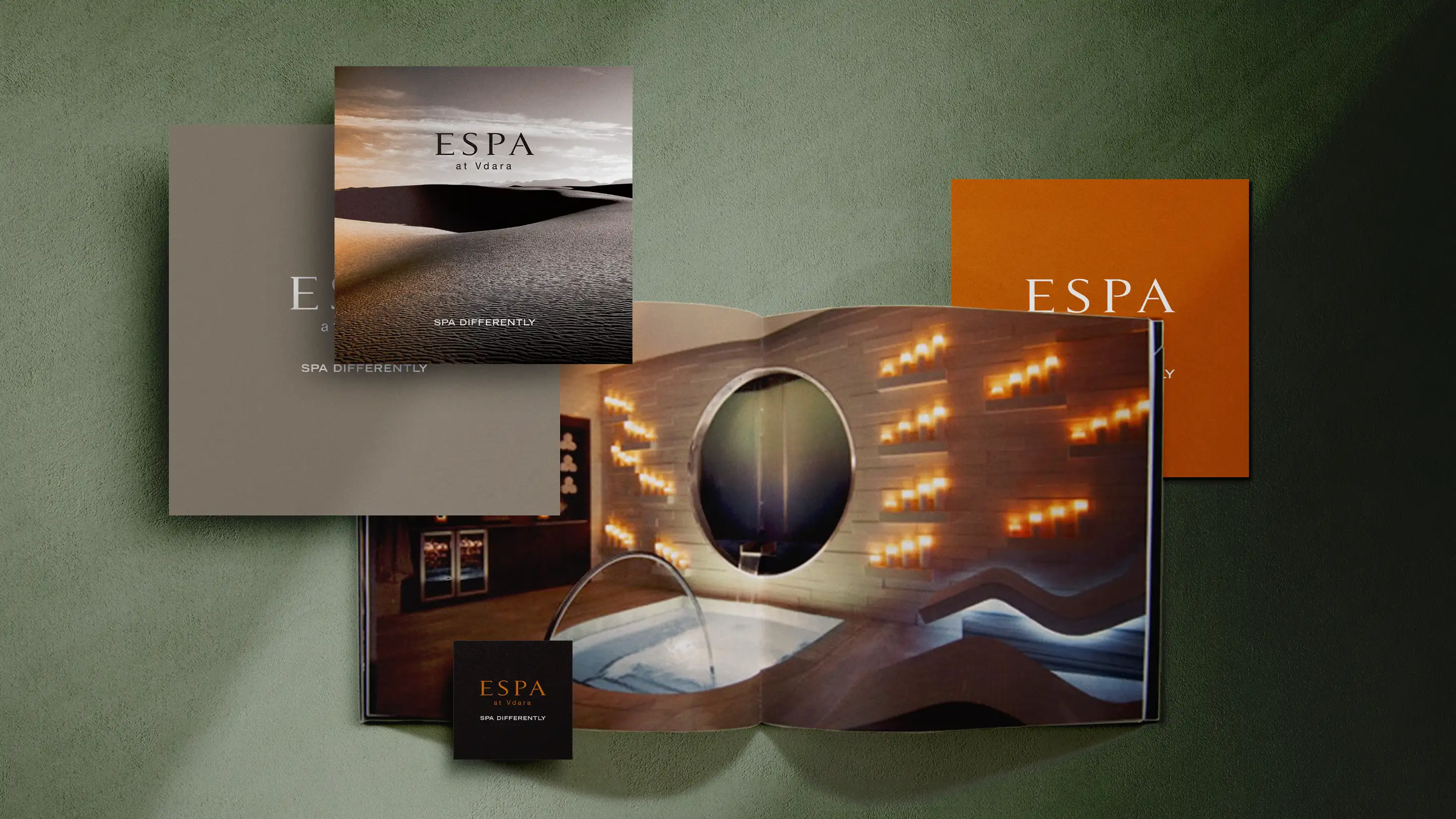

Calm and collected
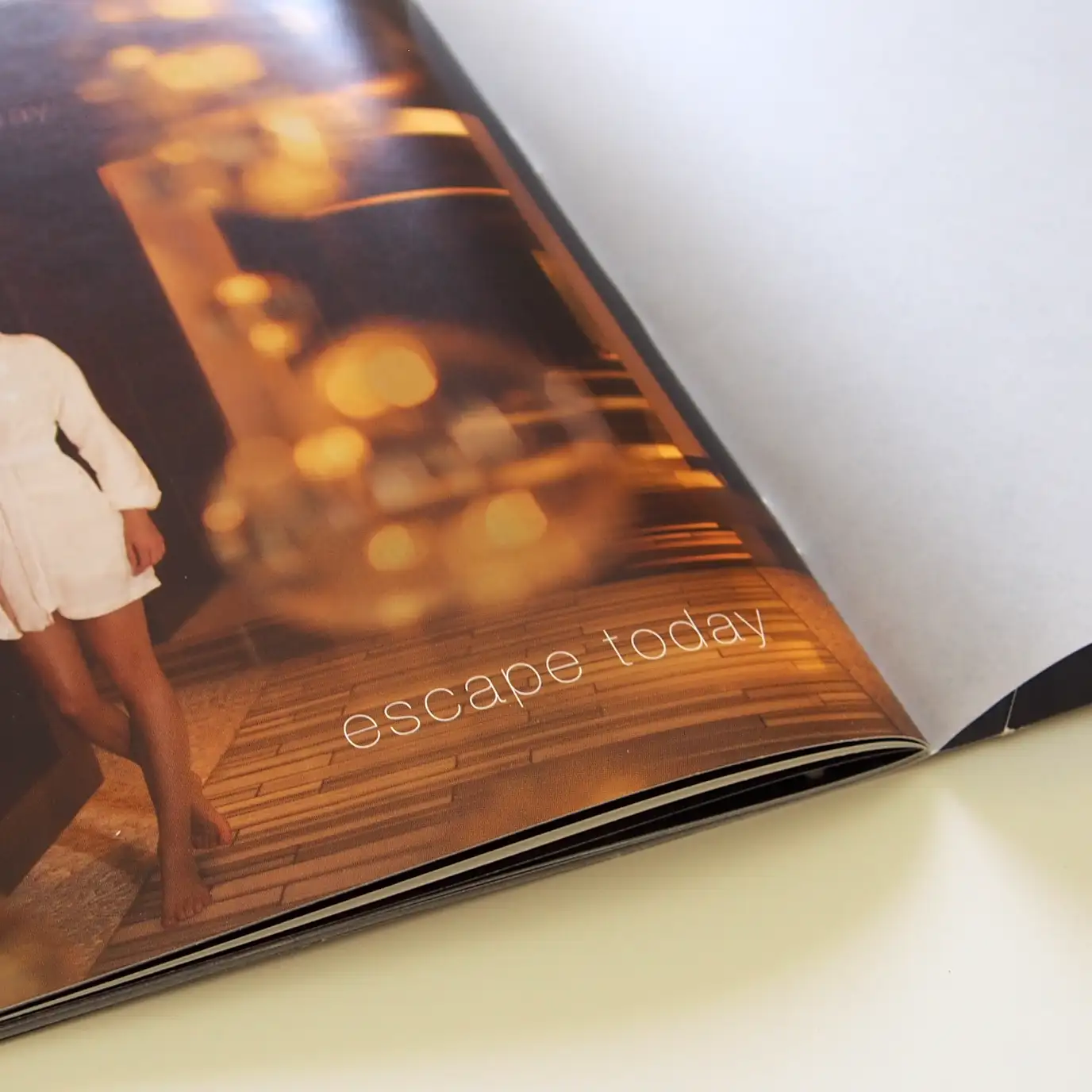
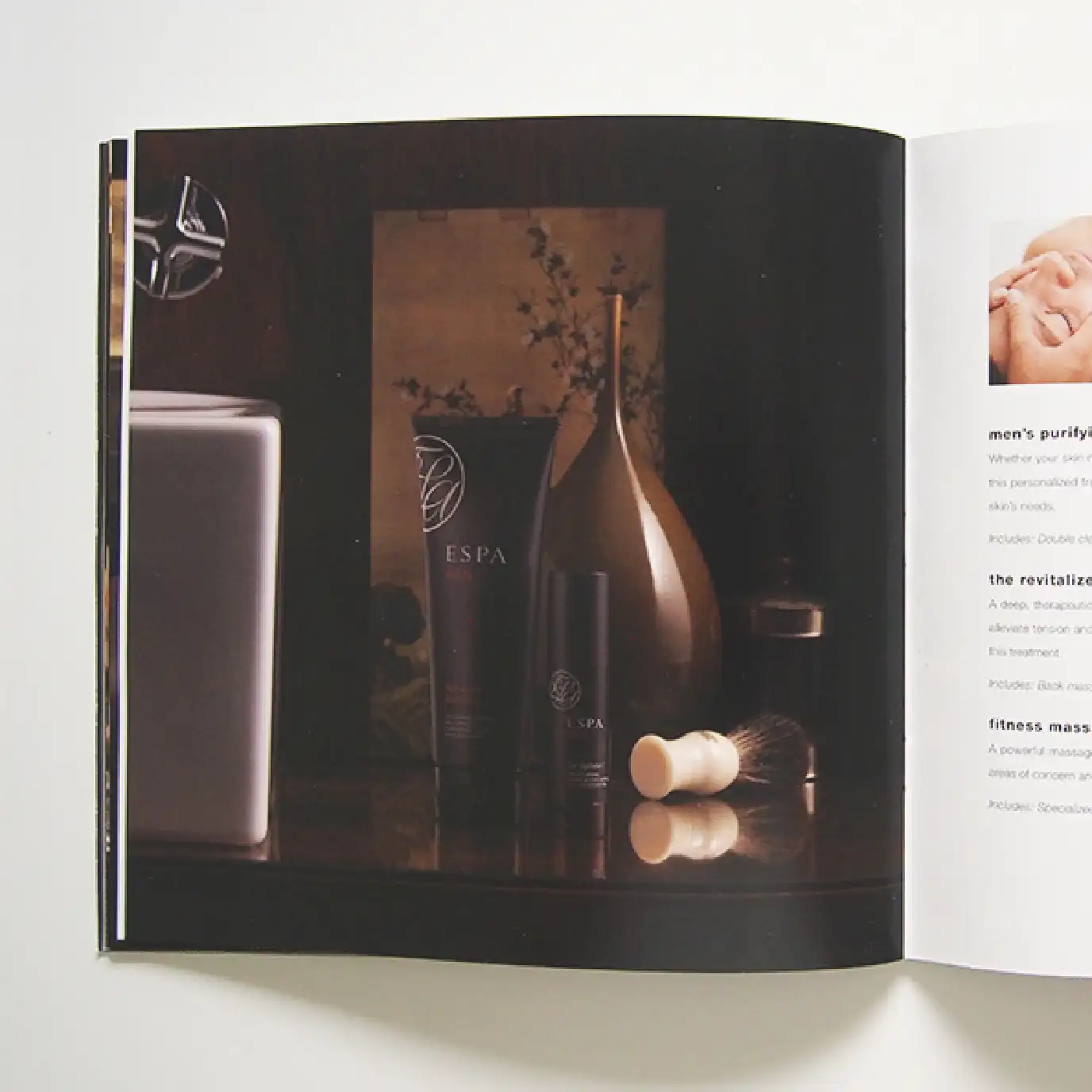
A high-end, full-color amenities and services brochure established the defining aesthetic of the co-branded look. We worked to marry the values of the spa and the existing brand system of the hotel utilizing minimalist yet luxurious finishes, soothingly abundant negative space and a sultry matte metallic gold ink.
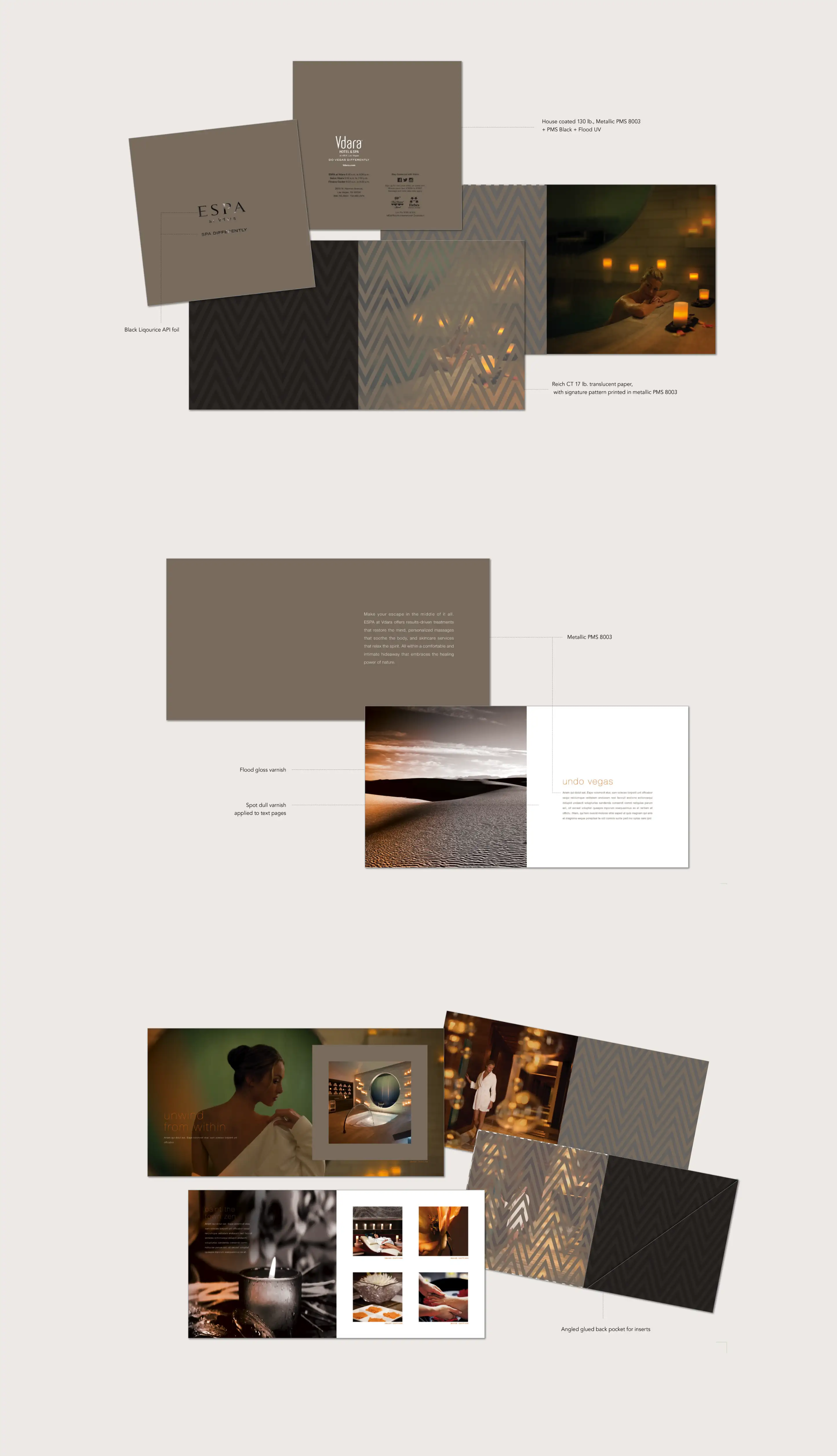

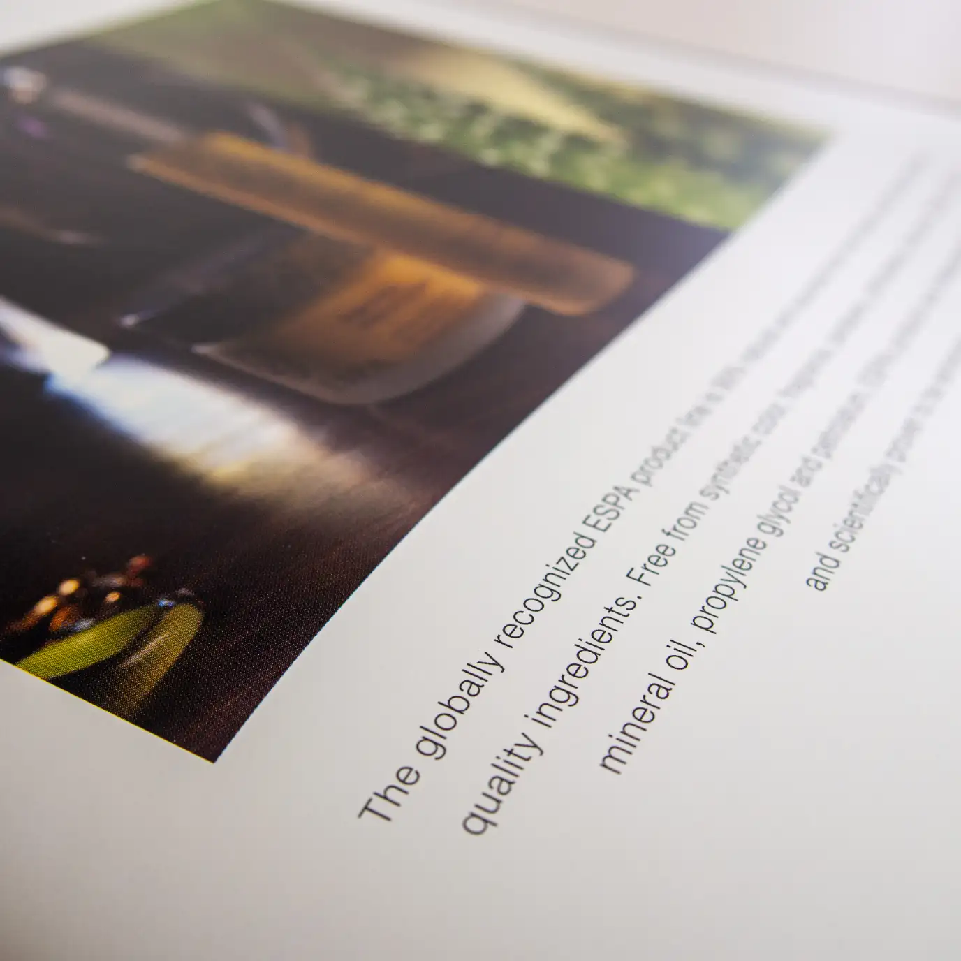
The brochure was printed on digital silk paper, hitting full-color photos with gloss UV to create a subtly elegant expression of the spa's services and amenities, while the structured layout promoted a sense of calm, ease and expansion.

Completing the journey
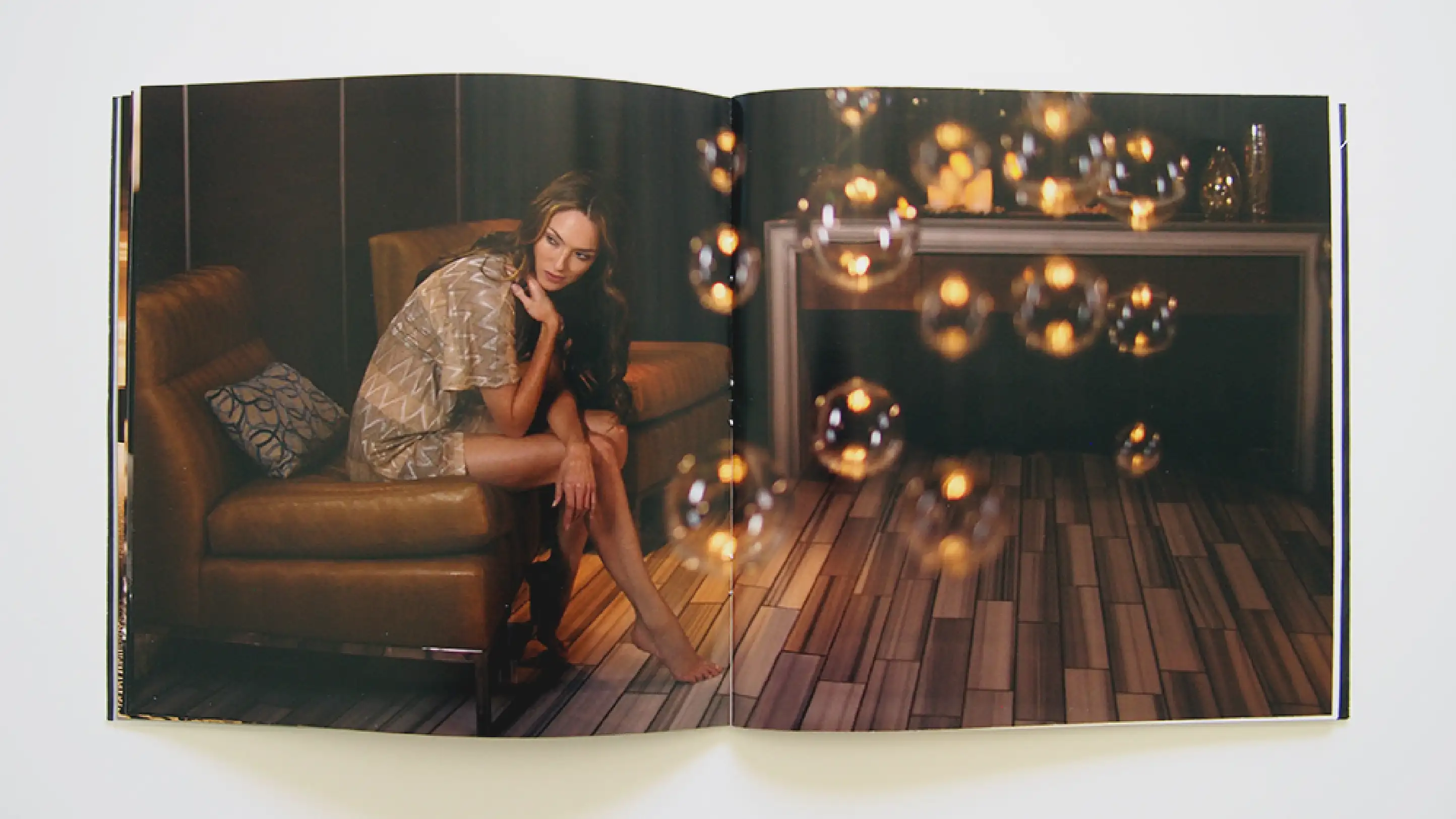
Mining the visual assets of each brand, as well as qualities of the spa’s interior spaces, we pulled common threads to weave together a singular aesthetic that could speak to the understated luxury inherent to both partners.
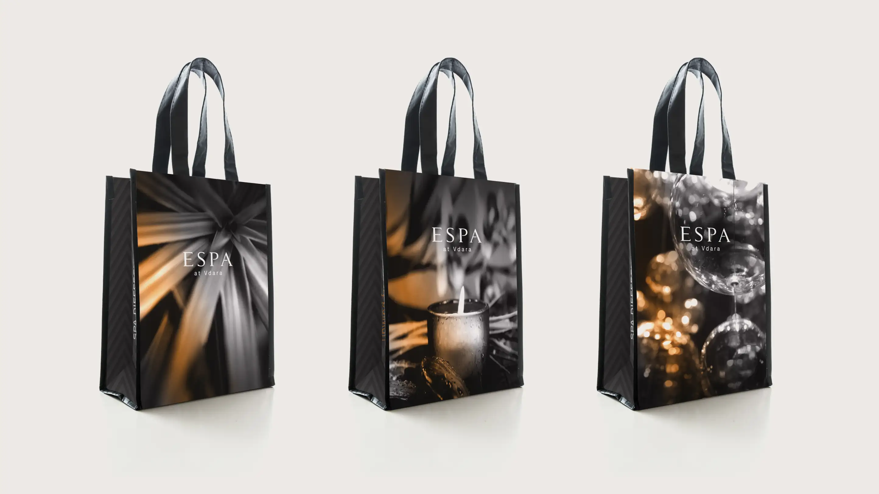
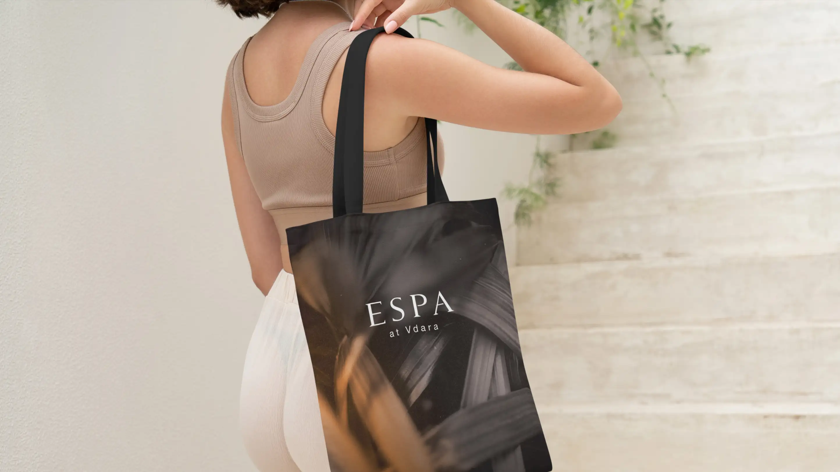
We built the look out to promote the spa refresh with key touchpoints along the guest journey, including hotel keycards, an eco-friendly tote, offer cards, postcards and turndown amenities.


